Thursday, September 23, 2010
Week 11: Final Evaluation
The first time that I saw this class and I signed up for it, I wanted to take it because I thought it would be nice to take something different than just the normal electives classes. The first five weeks here I have learned a lot and the last six weeks I have also learned much from this class. I learned the most from the book I would say. Advertising by Design gave this visual touch with what the advertising world like, but I was just reading it instead. The book always helped me have a better understanding on all of my projects including my final. The blog posts each week were interesting. The one I had the most fun time writing was for Jerry Metellus and my final project. In my personal opinion I think I did an okay job on my final project. I tried as much as I could to understand what I should write in the blog posts. My final I combined research I did from the book and the internet. My overall progress in the class I would have to say was very successful, expect for the week that I was sick. So other than that I didn’t have any problems catching up on my blog posts or doing my final. However, I have always had a hard time catching up on my twitter account. In my opinion though I did it and it got done. In conclusion I really did have a lot of fun in this class. It was great experience and I did learn a lot from this instructor and the book itself. Now onto the discussion about my grade, I think the same thing I did last time. Last time I thought I deserved a B and that is what I think this time as well. So I think that I deserve a B in this class.
Thursday, September 16, 2010
Analysis of Project in the Real World
Real World Advertising
Chef Boyardee was once the most popular kind of recipe in its history, but now Chef Boyardee has become second best to SpaghettiO’s. In real world advertising I suggest to Chef Boyardee to create a new kind of Chef Boyardee. The only thing I can do though is advertised the product and hope that it will work. “Composition: Critical Principles of Design: Design for advertising has a main thrust; combined with words, it stimulates perceptions in order to sell products, services and ideas.”(Advertising by Design by Robin Landa, pg. 125) My personal opinion was to create a billboard. I would think that building a billboard would help get Chef Boyardee out there because I think it could reach to more people. The reason why I think it would reach to more people is because most people are starting to have computers or cell phones with the Internet already built on it. So it would be easy for families who saw the billboard could go to the website. The way I created the billboard was the based on the hope that Chef Boyardee would take their product and make it more healthy and affordable. Plus I built a whole new chef. I built a super chef, because I figured that is what children are into these days and that the design would help build up the sales in Chef Boyardee. “It shouldn’t look like advertising: the product as the main visual, the logo, a formulaic layout utilized by many others, copy that sounds like a sales pitch.”(Advertising by Design by Robin Landa, pg. 143) Also I built another billboard where super chef goes against the old chef. The reason why I created this is because I wanted to give Chef Boyardee the option to the people the choice to choose between the old or the new one. I think that would be the best option because it will get people involved and hopefully the people that already buy Chef Boyardee will tell more people about it. In conclusion, I am not sure whether or the not the advertisement would really work, but I would at least be hopeful for the change.
Chef Boyardee was once the most popular kind of recipe in its history, but now Chef Boyardee has become second best to SpaghettiO’s. In real world advertising I suggest to Chef Boyardee to create a new kind of Chef Boyardee. The only thing I can do though is advertised the product and hope that it will work. “Composition: Critical Principles of Design: Design for advertising has a main thrust; combined with words, it stimulates perceptions in order to sell products, services and ideas.”(Advertising by Design by Robin Landa, pg. 125) My personal opinion was to create a billboard. I would think that building a billboard would help get Chef Boyardee out there because I think it could reach to more people. The reason why I think it would reach to more people is because most people are starting to have computers or cell phones with the Internet already built on it. So it would be easy for families who saw the billboard could go to the website. The way I created the billboard was the based on the hope that Chef Boyardee would take their product and make it more healthy and affordable. Plus I built a whole new chef. I built a super chef, because I figured that is what children are into these days and that the design would help build up the sales in Chef Boyardee. “It shouldn’t look like advertising: the product as the main visual, the logo, a formulaic layout utilized by many others, copy that sounds like a sales pitch.”(Advertising by Design by Robin Landa, pg. 143) Also I built another billboard where super chef goes against the old chef. The reason why I created this is because I wanted to give Chef Boyardee the option to the people the choice to choose between the old or the new one. I think that would be the best option because it will get people involved and hopefully the people that already buy Chef Boyardee will tell more people about it. In conclusion, I am not sure whether or the not the advertisement would really work, but I would at least be hopeful for the change.


Promotion
Promotion
Chef Boyardee is promoted through their website and usually television. Well I was thinking what about a billboard. That would be different for Chef Boyardee to do, but if they want to get out there to families before SpaghettiO’s does; why not put it on a big poster saying hey come buy our product. So my idea for promotion is to put my new idea of Chef Boyardee’s design on to a billboard along with some kind of information and something to say on it. I am hoping what I will get out of it will be for customers to realize the benefits and differentiation between SpaghettiO’s. In conclusion I am hoping that my new advertisement will bring in more families for Chef Boyardee. “Who is the audience? Whoever is on the end of a commercial or public service communication, either a group or an individual, is the audience.” (Advertising by Design by Robin Landa, pg. 35) “Know your audience: What do they think about your brand? Your cause? What do you want them to think?”(Advertising by Design by Robin Landa, pg. 50) “Audience and Appropriateness: Here’s the cardinal rule: know your audience. Know what they’ll tolerate. Know what they won’t tolerate. Know what they find distasteful. Know their limits. Understand what they think is cool and not cool.”(Advertising by Design by Robin Landa, pg. 142) “What falls under the: typical ad appearance; category? Looks like a visual sales pitch, product is obvious, not usually unified, little graphic impact, not memorable, no visual surprise, boring.”(Advertising by Design by Robin Landa, pg. 149) “Verbal/Visual Relationship: If you think of the relationship between the verbal message and the visual message as that of an old-time comedy team, where one is the straight person and one is the funny person, then you can begin to understand this; if you have unusual verbal message then the visual should be straightforward.”(Advertising by Design by Robin Landa, pg. 159) “Designing Print Campaigns: Once you have your strategy formulated and have conceived advertising concepts or ideas then it’s time to design.”(Advertising by Design by Robin Landa, pg. 162)
Chef Boyardee is promoted through their website and usually television. Well I was thinking what about a billboard. That would be different for Chef Boyardee to do, but if they want to get out there to families before SpaghettiO’s does; why not put it on a big poster saying hey come buy our product. So my idea for promotion is to put my new idea of Chef Boyardee’s design on to a billboard along with some kind of information and something to say on it. I am hoping what I will get out of it will be for customers to realize the benefits and differentiation between SpaghettiO’s. In conclusion I am hoping that my new advertisement will bring in more families for Chef Boyardee. “Who is the audience? Whoever is on the end of a commercial or public service communication, either a group or an individual, is the audience.” (Advertising by Design by Robin Landa, pg. 35) “Know your audience: What do they think about your brand? Your cause? What do you want them to think?”(Advertising by Design by Robin Landa, pg. 50) “Audience and Appropriateness: Here’s the cardinal rule: know your audience. Know what they’ll tolerate. Know what they won’t tolerate. Know what they find distasteful. Know their limits. Understand what they think is cool and not cool.”(Advertising by Design by Robin Landa, pg. 142) “What falls under the: typical ad appearance; category? Looks like a visual sales pitch, product is obvious, not usually unified, little graphic impact, not memorable, no visual surprise, boring.”(Advertising by Design by Robin Landa, pg. 149) “Verbal/Visual Relationship: If you think of the relationship between the verbal message and the visual message as that of an old-time comedy team, where one is the straight person and one is the funny person, then you can begin to understand this; if you have unusual verbal message then the visual should be straightforward.”(Advertising by Design by Robin Landa, pg. 159) “Designing Print Campaigns: Once you have your strategy formulated and have conceived advertising concepts or ideas then it’s time to design.”(Advertising by Design by Robin Landa, pg. 162)
The Big Idea
The Big Idea
The big idea about Chef Boyardee is that they sell their products to aim towards kids rather than adults. “Where do big ideas come from? Every advertising creative professional talks and dreams of “the big idea.” The idea is the unique thinking behind an ad or an ad campaign, usually based on an emotional or functional benefit, or on brand spirit or style.”(Advertising by Design by Robin Landa, pg. 67) The big idea for Chef Boyardee is based on these observations. Their visual analogy is using the chef on each one of their products to show some kind of person has cooked this food and it is delicious. “Visual Analogy: is a comparison based on similarities or parallel qualities.”(Advertising by Design by Robin Landa, pg. 67) The chef was made to make the brand known and recognized between kids and their parents. “Visual Metaphor: When you use one thing to identify another, that’s a metaphor.”(Advertising by Design by Robin Landa, pg. 69) Chef Boyardee also has a visual metaphor between overstuffed ravioli and mini ravioli’s. On one you can see big ravioli and on another you see a bunch of tiny ravioli’s and if you open the cans the pasta would look like that too. “Comparison: Comparing foods or beverages based on taste is not a strong premise.”(Advertising by Design by Robin Landa, pg. 79) Chef Boyardee is always in comparison with SpaghettiO’s, people can never usually decided which one is better for you; they just know that Chef Boyardee offers more choices. For example, Chef Boyardee has kits that come in pizza (both cheese and pepperoni) and lasagna. I have never seen SpaghettiO’s produce kits; they usually just come out with new shapes. The facts about Chef Boyardee are that it is all about the fun and the pleasure of eating Chef Boyardee. That is why they are aimed to kids and parents.
Also there are three things I asked myself about Chef Boyardee. It is original? Is the idea relevant? And does it make an emotional connection with the target audience? First question: I think that Chef Boyardee is original based on the fact that it was made by Boiardi and he first had a restaurant and when the demand became to great for his masterpiece, he built a factory and called it Boyardee so people would say his name right. Later on it was sold to ConAgra Foods and has been produced ever since. Second question: I think the idea is relevant. I mean hey what is better than to aim towards families that need food for a cheaper price. The food is delicious and healthy so what could be better? Third question: Chef Boyardee does make that emotional connection with parents and kids because it is a trusted brand and the customers are used the changes of pasta along with Chef Boyardee. In conclusion Chef Boyardee’s big idea is to make their food delicious and cheap for families.
Comparative Analysis
SpaghettiO’s
Chef Boyardee is good pasta, but does it stand up to SpaghettiO’s? “Comparison: comparing a product or service to something different from it.”(Advertising by Design by Robin Landa, pg. 79) I think that SpaghettiO’s is the biggest competition for Chef Boyardee. They are three reasons why. One: SpaghettiO’s like Chef Boyardee draws customers in by telling people that their pasta is healthy and good for kids. Two: SpaghettiO’s offer what their pasta has that makes their kids healthy right on their front page, Chef Boyardee doesn’t they have a newsletter that you can sign up for. Three: SpaghettiO’s plan on improving by making their products healthier and affordable for all their customers. Also SpaghettiO’s is facing an challenge right now, because their company Campbell’s had to recall SpaghettiO’s with Meatballs in 14.75-ounce cans; SpaghettiO’s A to Z with Meatballs in 14.75-ounce cans; and SpaghettiO’s Fun Shapes with Meatballs (Cars) in 14.75-ounce cans.
("http://www.campbellsoup.com/spaghettios.asp")
Chef Boyardee will be bigger and better pasta than SpaghettiO’s because I think that Chef Boyardee should also aim for making their products healthier and affordable for their customers. “Association: our tendency to form mental connections between brands and memories is what this category of ads can bank on, encouraging emotional bonds between the consumer and the brand.”(Advertising by Design by Robin Landa, pg. 119) Also I think that maybe Chef Boyardee should expand on offering some new products for adults more than kids. “The relationship of form and content in the campaign should be appropriate and meaningful.”(Advertising by Design by Robin Landa, pg. 168) Chef Boyardee might also want to consider putting their health facts on their website and how much their pasta costs. I think that this would be a great start for Chef Boyardee. In conclusion Chef Boyardee needs a good campaign to beat SpaghettiO’s. “A good print campaign is only as good as the ideas that holds it together. A central thought, carried throughout the campaign, will make people stop and feel something.”(Advertising by Design by Robin Landa, pg. 173)
MLA Format
1. "Campbell's Welcome." http://www.campbellsoup.com/spaghettios.asp. Campbell's, 2005. Web. 14 Sep 2010..
Chef Boyardee is good pasta, but does it stand up to SpaghettiO’s? “Comparison: comparing a product or service to something different from it.”(Advertising by Design by Robin Landa, pg. 79) I think that SpaghettiO’s is the biggest competition for Chef Boyardee. They are three reasons why. One: SpaghettiO’s like Chef Boyardee draws customers in by telling people that their pasta is healthy and good for kids. Two: SpaghettiO’s offer what their pasta has that makes their kids healthy right on their front page, Chef Boyardee doesn’t they have a newsletter that you can sign up for. Three: SpaghettiO’s plan on improving by making their products healthier and affordable for all their customers. Also SpaghettiO’s is facing an challenge right now, because their company Campbell’s had to recall SpaghettiO’s with Meatballs in 14.75-ounce cans; SpaghettiO’s A to Z with Meatballs in 14.75-ounce cans; and SpaghettiO’s Fun Shapes with Meatballs (Cars) in 14.75-ounce cans.
("http://www.campbellsoup.com/spaghettios.asp")
Chef Boyardee will be bigger and better pasta than SpaghettiO’s because I think that Chef Boyardee should also aim for making their products healthier and affordable for their customers. “Association: our tendency to form mental connections between brands and memories is what this category of ads can bank on, encouraging emotional bonds between the consumer and the brand.”(Advertising by Design by Robin Landa, pg. 119) Also I think that maybe Chef Boyardee should expand on offering some new products for adults more than kids. “The relationship of form and content in the campaign should be appropriate and meaningful.”(Advertising by Design by Robin Landa, pg. 168) Chef Boyardee might also want to consider putting their health facts on their website and how much their pasta costs. I think that this would be a great start for Chef Boyardee. In conclusion Chef Boyardee needs a good campaign to beat SpaghettiO’s. “A good print campaign is only as good as the ideas that holds it together. A central thought, carried throughout the campaign, will make people stop and feel something.”(Advertising by Design by Robin Landa, pg. 173)
MLA Format
1. "Campbell's Welcome." http://www.campbellsoup.com/spaghettios.asp. Campbell's, 2005. Web. 14 Sep 2010.
Name of product:Slogan
Chef Boyardee
Chef Boyardee: The new and improved chef is back in business. “Getting Started: Interpret the problem. Advertising involves creative problem solving. If your idea is creative and doesn’t solve the problem, it’s not an effective ad.”(Advertising by Design by Robin Landa, pg.50) I came up with this slogan for Chef Boyardee because I thought it was different. The reason why I think it is unique is because Chef Boyardee has not changed their campaign at all expect for their pictures of new pasta. So I thought this time it would be nice to see a new face. What it means is that I plan to redesign Chef Boyardee to be a younger chef. I think that this will work out because it seems that Chef Boyardee aims their products more towards kids than adults. I don’t know if a new chef would really work in the adult community, but the younger chef would relate more the kid customers. “The Problem is the Solution: taking a negative and making a positive.”(Advertising by Design by Robin Landa, pg. 75) For example, Chef Boyardee should take a chance on a new ad campaign. So I personally think that Chef Boyardee’s new advertisement campaign should be with a new and improved chef and a way to redesign the advertisement on the cans of pasta. “What makes an Ad: An ad in any visual medium is almost always a cooperative relationship between words and images.”(Advertising by Design by Robin Landa, pg. 52) In conclusion I think that it is time for past Chef Boyardee to move aside and make room for the new Chef Boyardee. “Creative Approaches: a creative approach in advertising must be appropriate for the product or service and communicate and enhance the client’s message.”(Advertising by Design by Robin Landa, pg. 174)
Chef Boyardee: The new and improved chef is back in business. “Getting Started: Interpret the problem. Advertising involves creative problem solving. If your idea is creative and doesn’t solve the problem, it’s not an effective ad.”(Advertising by Design by Robin Landa, pg.50) I came up with this slogan for Chef Boyardee because I thought it was different. The reason why I think it is unique is because Chef Boyardee has not changed their campaign at all expect for their pictures of new pasta. So I thought this time it would be nice to see a new face. What it means is that I plan to redesign Chef Boyardee to be a younger chef. I think that this will work out because it seems that Chef Boyardee aims their products more towards kids than adults. I don’t know if a new chef would really work in the adult community, but the younger chef would relate more the kid customers. “The Problem is the Solution: taking a negative and making a positive.”(Advertising by Design by Robin Landa, pg. 75) For example, Chef Boyardee should take a chance on a new ad campaign. So I personally think that Chef Boyardee’s new advertisement campaign should be with a new and improved chef and a way to redesign the advertisement on the cans of pasta. “What makes an Ad: An ad in any visual medium is almost always a cooperative relationship between words and images.”(Advertising by Design by Robin Landa, pg. 52) In conclusion I think that it is time for past Chef Boyardee to move aside and make room for the new Chef Boyardee. “Creative Approaches: a creative approach in advertising must be appropriate for the product or service and communicate and enhance the client’s message.”(Advertising by Design by Robin Landa, pg. 174)
EOC Week 9: Triplets

I have decided that this was a triplet advertisement because it has three different lines, three different pictures, but it is all about the same company.”The visual changes, the line changes, but the compositional template stays the same.” (Advertising by Design by Robin Landa, pg. 169) Their visual changes are the pictures between the moving balls, the CD and a machine that spins. The line changes are “Move in a different direction” “Get into a new groove” and “Experience a new spin on banking”. The compositional template stays the same throughout the advertisement. It is has a picture then some type then information about Androscoggin Bank. This advertisement is talking about Androscoggin Bank. Androscoggin Bank is trying to make people be interested in their bank by this advertisement. They are saying “move in a different direction” which might mean to you that hey if your bank isn’t the way you thought it would be then try theirs. “Get into a new groove” If your bank isn’t paying attention to you than try theirs. “Experience a new spin on banking” if you don’t like banking, that’s okay, try our online banking. Androscoggin wants to get across to people that they have personal and business banking. A little bit of information on Androscoggin. They have these services: savings, checking accounts, certificates of deposits, personal and commercial loans, online banking and bill payment. They also have: cash management, retirement planning, investment management, and employee benefit programs. Also if you would like to learn more information about them you can go online to
http://www.androscogginbank.com/. In conclusion Androscoggin Bank created a wonderful triplet advertisement by keeping it neat and simple. The text is easy to read and they give information about the bank if you would really like to join, I am pretty sure they would be happy about that.
MLA Format
"Androscoggin Bank." LinkedIn. LinkedIn, 2010. Web. 16 Sep 2010. http://www.linkedin.com/companies/androscoggin-bank>.
EOC:Week 10: Art Serving Capitalize
Art Serving Capitalism
What is capitalism? Answers.com says that it is “an economic system in which the means of production and distribution are privately or corporately owned and development is proportionate to the accumulation and reinvestment of profits gained in a free market.” ("Answers.com")
Okay now let’s try that in English. Basically America is capitalism; it is a bunch of corporations that hire people to make money. Then those employees make money which is good. What is art? Based again on Answers.com it has many definitions. It is a work of nature, color, movement, a body painted on a piece of paper. Art can be anything that you want it to be. Now whether or not you would actually buy or sell that piece of art is up to you. That is the beautiful freedoms of being able to have art serve capitalism, because hey you never know; you could be the next Picasso. Art serving capitalism is basically a person who makes art and sells it to profit from it by making money. That isn’t a bad thing. Especially if take that art and make it into a gallery. Then people would come to pay to get into the gallery to see your art and in even in your gallery you can list prices for your artwork so you can make profit of your work. The only bad part about it is; is that people can steal from your artwork and sometimes you may not even know it. Then that person makes money stealing of your artwork and makes profit from that. So if you are an artist make sure that if you want to be serving capitalism that you protect your work, because it is that easy to just take a picture of it or see it online and make a few changes to it and call it theirs. In conclusion, art serving capitalism has it good sides and its bad sides.
MLA Format
"Capitalism." Answers.com. Answers Corporation, 2010. Web. 16 Sep 2010. http://www.answers.com/topic/capitalism>.
Thursday, September 2, 2010
EOC Week 8: Really Good Emaple of Chapter 8

I am planning on using an advertisement from Crest 3D White. This advertisement goes to people who are emotional about how their teeth look. If they look bad Crest tries to hit them with the answer to not be afraid of your smile. This is Crest 3D advertisement: it shows a woman smiling with Crest 3D White logo on the side of the page along with the collection of 3D White. Then the advertisement says this: Heads Will Turn (headline) Whiter Smile IN 1 Day (sub line). Now get a smile that’s more than white-it’s 3D White. Introducing the Crest 3D White collection. Use each product individually. Or use the collection together to start seeing results in 1 day. Intrigued? Let us prove it to you at 3DWhite.com. Michael Sickinger, Firmenich, New Jersey says “Always make sure your type conveys the same feeling as the piece it’s going into; every font has an attitude.” (Advertising by Design by Robin Landa, Pg 163) I personally think that this advertisement has the right attitude because of the colors. The typeface is mostly white except for the blue font with the faded white background. Denise M. Anderson, DMA, New Jersey “when choosing a headline type, review each letter you will need, to see if those letters are interesting. The font may have the sexiest s you have ever seen, but if it is not in your headline, it will be of no use to you.” (Advertising by Design by Robin Landa, Pg 163) I think that this advertisement did a good job on the headline. It’s not too big and it is “white” enough for us to see. In conclusion, I think that this is a good advertisement by the way they put it together. The logo is over the picture and it is someplace where you can see it, along with the collection. Also the typeface is readable and noticeable for us to see it. So good job Crest 3D White.
EOC Week 8:Authority
I want to be able to re-create the design of the company Chef Boyardee. The reason why I want to change Chef Boyardee is because they haven’t changed their advertising for years and most people that our in our generation don’t even know what Chef Boyardee. So I want to make Chef Boyardee more noticeable to children since Chef Boyardee is aimed towards children. So the way I have decided to re-create Chef Boyardee is with a new chef. This person helped me out on my project mostly about font and to keep it interesting. So Denise M. Anderson is the person I am looking up to for my re-design. Denise M. Anderson, DMA, New Jersey had these five points. One: “make choices appropriate to project objectives (client, market, period, etc.). Two: “keep the selection interesting (for example, if choosing Didot, which is a serif font, choose a second font that has a slightly different serif, so that it stands out).” Three: “when choosing a headline type, review each letter you will need, to see if those letters are interesting. The font may have the sexiest s you have ever seen, but if it is not in your headline, it will be of no use to you.” Four: “make sure text fonts are easy to read.” Finally five: “Use the various weights and styles of a font for variation, rather than choosing combinations of two or three fonts. Too many fonts may make a piece look like it was designed by an inexperienced designer.” This would help me because I need to find some typeface that would fit with the new Chef Boyardee style I want to make for the advertisement. This also inspires me, because it gives me some good ideas for the Chef Boyardee Company. So thanks Denise M. Anderson.(Advertising by Design by Robin Landa, pg.163)
Thursday, August 26, 2010
EOC Final Project: First Thoughts
My first thoughts about this project are I was thinking about Kraft Marconi and Cheese while I was eating it. I don’t know if they have invented a three cheese for Kraft. I think that would be cool and interesting, because I love three cheese pasta and I think if Kraft could find a way to develop that with their original cheese I think that would be a great seller. Then I thought about how I couldn’t really think of a slogan for that because Kraft has been around forever so I wasn’t sure if that was a good idea or not. Other than that I don’t really have any other thoughts right now.
EOC Week 7: Exciting Advertisement x4

I chose this advertisement because I thought it was different. People don’t usually produce advertisements like this anymore.
Balance: One of the keys on this advertisement is balance. This advertisement has asymmetrical balance. It leads your eye one way to the point of what the advertisement is trying to make you see. What the advertisement is trying to make you see is the car and then read the fine print about fast cars.
Positive/Negative Shapes and Space: Another key point to this advertisement is the positive and negative space. The advertisement is nearly everywhere to represent the fast car Datsun. So the advertisement looks crunched up with the pictures and the logo right in the middle but it is leaning on the side.
Visual Hierarchy: The third key in this advertisement is the visual hierarchy. The main message of this advertisement is teaching people how to drive and doing by driving a fast car. So you want to give people a real challenge to driving? Give them a sports car. They are trying to sell the car which also comes in sedans, wagon, pickups and sports cars.
Illusion: Finally the fourth key in this advertisement is the illusion of the pop out car. The car which they also show in the advertisement looks like it is coming towards you. In my personally opinion I feel like I could touch it.
Personally I think that this advertisement has all these key points because of the way that Datsun decided to represent their advertisement. It looks fun and different. Plus it has a meaning to the advertisement about driving safe and choosing the right car.
EOC Week 6:Make 'Em Laugh
Diet Dr. Pepper made this commercial where there is a wedding being held. The bride is treating her friends like their in boot camp and they are going to do what she says. Then when while the bride is walking away her friend drinks a Diet Dr. Pepper and the commercial says “It’s amazing the sacrifices you’ll make for friendship when it’s comes to the taste of Diet Dr. Pepper you sacrifice nothing. Diet Dr. Pepper tastes more like regular Dr. Pepper.” So the commercial is trying to say that if you drink Diet Dr. Pepper everything will be just fine. The reason why I think this commercial is funny is because I like the fact that the bride and starts to tell the brides what she wants on her wedding day. Then her friends have the expression of “wow really, you’re crazy” and then one of the bride’s friends drinks a Diet Dr. Pepper to be calmer than the others. So it’s funny because you have the bride who wants everything perfect and then the Diet Dr. Pepper to say “hey it’s okay, it’s your friend’s wedding so just chill out and everything is going to be fine”. So to me personally it’s funny. I also like the way that Dr. Pepper delivers the commercial. They tried to make a funny commercial and they delivered. It wasn’t offensive and look likes something that would happen in real life. So in conclusion Dr. Pepper did a good job.
http://www.youtube.com/watch?v=w5FyApwObiY&NR=1
http://www.youtube.com/watch?v=w5FyApwObiY&NR=1
Thursday, August 19, 2010
EOC Week 6: Jerry Metellus

Jerry Metellus
A. Introduction
a. The three things I learned from Jerry Metellus.
i. One: Price marketing depends on a lot of things in photography.
ii. Two: Don’t come in with an ego or an attitude. Also don’t be attached or desperate.
iii. Three: Lighting is very dependable on all events, especially architecture.
B. One: Price marketing depends on a lot of things in photography. Price depends on what your client wants and what you agreed to shoot your client in. For example, if you are shooting a family photo and they want to look exactly like this magazine photo and that is what you agreed to shoot them in that is the challenge you decided to take. Price depends on what you are shooting in, hotel, broken down building, etc. Price depends on what the client wants to look like. What the photographer can do is research about prices from other photographers. So price ranges with in different situations.
C. Two: Don’t come in with an ego or an attitude. Also don’t be attached or desperate. When it comes to Jerry, he doesn’t want to shoot anyone who has an ego or an attitude. So photographers so deserve to work with what you can handle and have some respect and dignity to it. Don’t be attached to your work and don’t be desperate for work. For example, you are a Sudan and somebody doesn’t want you then you don’t try to get that person. You are selling the car; sell it to someone who wants it. Also don’t be desperate because then you break the market for selling yourself so low. So don’t have an ego, but be competitive enough that clients know your worth it.
D. Three: Lighting is very dependable on all events, especially architecture. Lighting depends on seasons, the way the structure edges come out along with the colors. This is the way your practice your lighting for architecture to make texture come out or smoothness from the table or couch. So lighting is different in any situation.
Thursday, August 12, 2010
EOC: Week 5: Ad Catergories
The first category
• Image or Lifestyle
http://img3.imageshack.us/img3/6789/elle201001page013.jpg
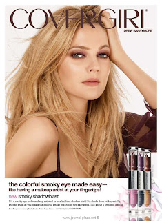
• The reason why this would be an advertisement for Image/Lifestyle is because Cover Girl is a beauty product that most women wear. And women usually think that if the wear cover girl products then they can look like (Drew Barrymore). It is a brand that they trust and know well enough to wear it for most of their life.
The second category
• Adventures and Escapes

http://web.me.com/anthonymingo/iWeb/anthonymingo/disney_files/droppedImage.png
• The reason why I think this represents Adventures and Escapes is because Disney is an adventure and escape. As the advertisement presents itself, to me it is saying. In the hotel you can rest and enjoy the day, but outside is where the fun is.
The third category
• Benefits
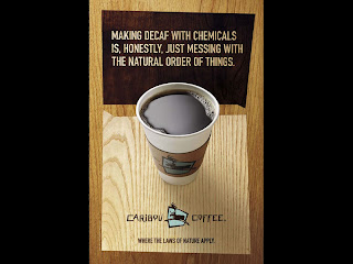
http://www.valueofadvertising.org/images/big/content-coffie.jpg
• The reason why I think this advertisement represents benefits is because the advertisement is offering you the brand (Caribou Coffee) which is saying that their brand offers genuine coffee and what is in it for us is drinking some good coffee without having to go decaf.
• Image or Lifestyle

http://img3.imageshack.us/img3/6789/elle201001page013.jpg
• The reason why this would be an advertisement for Image/Lifestyle is because Cover Girl is a beauty product that most women wear. And women usually think that if the wear cover girl products then they can look like (Drew Barrymore). It is a brand that they trust and know well enough to wear it for most of their life.
The second category
• Adventures and Escapes

http://web.me.com/anthonymingo/iWeb/anthonymingo/disney_files/droppedImage.png
• The reason why I think this represents Adventures and Escapes is because Disney is an adventure and escape. As the advertisement presents itself, to me it is saying. In the hotel you can rest and enjoy the day, but outside is where the fun is.
The third category
• Benefits

http://www.valueofadvertising.org/images/big/content-coffie.jpg
• The reason why I think this advertisement represents benefits is because the advertisement is offering you the brand (Caribou Coffee) which is saying that their brand offers genuine coffee and what is in it for us is drinking some good coffee without having to go decaf.
Thursday, August 5, 2010
EOC Week Four: Bob Isherwood. Whi is he important?

Interview: Bob Isherwood
• Who is Bob Isherwood?
Bob Isherwood was born in Australia and when he left school he was given a very rare opportunity to be in RMIT (Royal Melbourne Institute of Technology) to study Advertising Art. After school he went to the United Kingdom to work for Collett, Dickenson, and Pearce which were at that time the best advertising company. In 1986 he was hired to work for Saatchi and Saatchi and became their creative director in 1988. “In 2007 he received the Clio Lifetime Achievement Award “in recognition of outstanding and ongoing contribution by an individual who is leading the industry forward.” “Then in 2009 Bob Isherwood became the Creative Chairman for UNI/IAA and he is currently partnered with LLC.
http://en.wikipedia.org/wiki/Bob_Isherwood
http://www.abeopartners.com/bob_isherwood/
• Why is Bob important?
Bob Isherwood is important because of his many awards and things he did in his life. Like for example, when Victor Greenhalgh passed away, Bob decided to make a scholarship in his name for unprivileged students that went to RMIT. Bob became the World Creative Director for Saatchi and Saatchi 1996. The company won 8,000 creative awards while Bob was working there. “Bob Isherwood was the first people to win Australia’s gold lion for cinema at the Cannes International Advertising Festival and is one of the few people to have ever won a British Design and Art Direction gold award for advertising.” “In December 2007, Bob received the first ever Honorary Doctorate in Communications from RMIT at a ceremony at the Melbourne Telstra Dome. In 2008, he was invited to contribute to the Australian Prime Minister Kevin Rudd’s “Australia 2020” initiative.” Bob Isherwood is also the co-producer for “World Changing Ideas”. Bob Isherwood is important because he worked hard and had great ideas.
http://en.wikipedia.org/wiki/Bob_Isherwood
http://www.abeopartners.com/bob_isherwood/
• One sample of Bob’s work.
• The Victor Greenhalgh Scholarship- “For some reason Victor Greenhalgh took a chance on me, and changed the course of my life,” says Mr. Isherwood, who came to RMIT after leaving school at 13 and beginning an apprenticeship as a motor mechanic.
I think that it is wonderful that Mr. Isherwood created a scholarship for someone that as he says “took a chance” on him.
http://www.rmit.edu.au/browse/About%20RMIT/Supporting%20RMIT/How%20giving%20made%20a%20difference/The%20Victor%20Greenhalgh%20Scholarship/
BOC Week 4: Jerry Della Femina The Big Idea
Jerry Della Femina was from Italian family who grew up in Brooklyn. Jerry understood what it was like to be in the advertising world unlike anyone else did. Jerry wrote “What’s the Ugliest Part of Your Body?”, “Your Fly is Open”, and “Before Hitler Could Kill Six Million Jews, He Had to Burn Six Million Books”. Jerry Della Femina was thirty years old when he invented the idea of “From Those Wonderful Folks Who Gave You Pearl Harbor”. When Jerry came up with the idea everyone was silent in the conference room. It was WWII and no one was exactly excited about the idea. Fortunately for Jerry that book made him the hottest business man in town. Funny thing is now in the future it is a source of inspiration for the series Mad Men. So the book it now being released for the series fourth season. The book is similar to series because of the sex and booze, but that is not the only story Jerry wants to tell. Jerry wants to tell about the class of warfare and how that advertising guys are not slick and sharp. So to say the best parts of the books are the ad making process, the battles with the superiors and the clients. So this book is more about sex and booze, it’s about war and the power you have to get clients and to win battles. For the first three seasons of Mad Men they did not seem to follow the book very well until now. So we hoping to see new things and more contexts towards the book that Jerry Della Femina wrote.
http://www.designobserver.com/observatory/entry.html?entry=14668
http://www.designobserver.com/observatory/entry.html?entry=14668
Thursday, July 29, 2010
EOC Week Three: Tobacco Advertisement

• Interpret the problem-
In my personal opinion the advertisement above states that Marlboro filter cigarette still tastes just as good as the unfiltered. They are advertising that the hand is holding a cigarette is holding a filtered cigarette that tastes as good as the original. I think that they are using a creative idea for the advertisement because they are using a hand for their phrase: “Flavor you can get a hold of”. It stands out and it’s saying straight out.
• Understand the creative brief-
I think that this advertisement was a good strategy because of the fact that they literally put a picture in that fits the advertisement. The flavor is still there with the filters.
• Say it outright-
I guess what I am trying to say is that they advertisement is making it seem like even though the filters are there cigarettes still taste just as good as the original stuff. Also like I said the advertisement placed a picture in that goes right along with what the advertisement is saying. Which makes it look cool and that cigarettes are still amazing.
• Know your audience-
Marlboro I know from certain people is the best kind of cigarettes out there. Marlboro used to be the most advertised cigarette out there. The cause of the Marlboro to get people to smoke cigarettes works all the time so obviously they know what they are doing. I want them to think that this advertisement is telling them what exactly the advertisement is saying.
• Write your objective-
My goal is try to describe to you the best I can how Marlboro is working very hard to make this advertisement work in their way and how it looks cool, the design works and they are getting out what they need to say.
Thursday, July 22, 2010
EOC Week 2: Ethics in Commercials
Tiger Woods’ new Nike advertisement: http://popwatch.ew.com/2010/04/07/tiger-woods-new-nike-ad-earl-woods/
In this advertisement Nike is showing Tiger Woods’ in black and white. They have Earl Woods playing in the background asking Tiger questions. These are the questions that are asked by “Earl Woods” to Tiger: “Tiger, I am more prone to be inquisitive. To promote discussion I want to find out what your thinking was. I want to find out what your feelings are. And did you learn anything?” Then after that it goes to close up on Tiger and then goes silent.
My opinion about the advertisement is that they used Tiger to talk more about his past and what he did. In my personal opinion what Nike did was horrible. They used Earl’s supposed voice to suppress Tiger into talking about what happened, but Tiger stayed silent. What is that supposed to mean. Also I think the whole black and white just sets the mood for someone to be upset about the commercial. Usually Nike is very professional and uses its commercials towards sports to sell shoes. I don’t see how this commercial is selling anything, expect to attract attention to Tiger Woods.
Also Tiger’s father died in 2006 that to me is unethical to use that kind of press on someone who already has gone through a lot and now has to deal with the press about Nike’s commercial using his dad’s voice. Also like I said it is not clear that they use Earl’s actual voice: “It’s not clear yet where the audio of Earl Woods, who passed away in 2006, originally came from, but using it to essentially rebuke Tiger for his behavior is definitely all kinds of striking.” Plus when Nike was asked about the commercial this is all they said: “We support Tiger and his family. As he returns to competitive golf, the ad addresses his time away from the game using the powerful words of his father.” So your using his dead father’s voice to remind him that he did wrong so he could be more stressed out then he is? I don’t know what Nike was thinking, but I definitely did not expect this from Nike and that makes me very disappointed in them, that they would be so unprofessional.
About Me
Hi my name is Melina Thompson and I am trying to become a web designer. I go to The Art Institute of Las Vegas which is a private institute. The Art Institute contains these bachelor’s degrees: Audio Production, Culinary Management, Digital Filmmaking and Video Production, Digital Photography, Fashion and Retail Management, Food and Beverage Management, Game and Art Design, Media Arts and Animation, Visual Effects and Motion Graphics, Interior Design, Web Design and Interactive Media. The Art Institute also offers associates’ degrees in: Baking and Pastry, Culinary Arts, Drafting Technology with AutoCAD and Interior Design. I go to the Art Institute to obtain a bachelors degree in Web Design and Interactive Media. At first I did not think I was going to be able to go to this school. I thought it was one of those impossible schools to get into like UCLA. When I went in for orientation I loved it. Chester (who used to work at the Art Institute, now works in California Art Institute) was the person who let me get in. Chester was impressed with my transcripts and awards I had from high school. So the first three quarters I was here I was going to try for Game and Art Design. It was the hardest quarters of my life, because I realized I couldn’t draw and my teachers also suggested that I go into another degree. So I talked to Jon Kerbaugh who suggested that I go into Web Design and Interactive Media since I was good with computers. So from my fourth quarter until now I have enjoyed being in my new major. So far I have learned how to design in many programs: Adobe Illustrator, Adobe InDesign, Adobe Photoshop, Adobe Premier Pro, Adobe After Effects, and Adobe Bridge. I have also learned how to code in Adobe Flash, Adobe Dreamweaver and Notepad. After I graduate I would like to get a job in Maine, because I would like to live somewhere that as all the seasons, instead of just two, like Las Vegas. Then one day I hope to college somewhere else so I can study and see the animals around the world. It has always been my dream to have a job like Steve Irwin of Jeff Gordon. I also hope to have my own business so I can create websites for professionals’. Also my other dream is to join the National Guard so I can serve my country and pay for my loans. It would also be great if I could travel all around the world and learn about other cultures and taste different kinds of food. I am world beat kind of person. I also love to watch movies and read books. So that is pretty much me in a nutshell.
Thursday, July 15, 2010
EOC Week 1: VW Lemon
“The ad featured a black and white photo of the Volkswagen Beetle with the word “Lemon” in bold san serif font… that proclaims that this particular car was rejected … of a blemish on the chrome piece of the glove box. The ad goes on to describe the rigorous inspection process...” (http://www.writingfordesigners.com/?p=1731)“This preoccupation with detail means the VW lasts longer and requires less maintenance, by and large, than other cars. (It also means a used VW depreciates less than any other car.)We pluck the lemons; you get the plums.” (http://mayanmuse.blogspot.com/2007/11/lemon-ad-by-ddb-for-volkswagen.html)“The Model T Ford was the first "people's car," but a brilliant engineer named Ferdinand Porsche dreamed of one for the German people. So did Adolf Hitler, who saw a Volkswagen as a way to secure himself as Germany's absolute ruler. With Der Fuhrer's patronage, Porsche designed a simple yet sophisticated machine with a distinctive beetle-like shape. But just as production got rolling, Hitler began World War II and the little car's future was very much in doubt.”
(http://auto.howstuffworks.com/1931-1945-volkswagen-beetle.htm)My personal opinion about the advertisement is that it is a great way to trick you into reading the piece of paper that is in front of you. Too many times I have seen people who read magazines go right pass the ads because they do not interest them. This advertisement caught many people’s attention because Volkswagen made fun of their car which made it funny. The other part is the investigation by Inspector Kurt Kroner, who rejected the car; which makes people interested in reading about the investigation. So not only does the advertisement entertains its customers but also gives them information. Since the advertisement was made they successfully sold the car. Plus since then there has not been such a great advertisement of this potential in a while. So in conclusion Volkswagen created one of the greatest ads in history.
(http://auto.howstuffworks.com/1931-1945-volkswagen-beetle.htm)My personal opinion about the advertisement is that it is a great way to trick you into reading the piece of paper that is in front of you. Too many times I have seen people who read magazines go right pass the ads because they do not interest them. This advertisement caught many people’s attention because Volkswagen made fun of their car which made it funny. The other part is the investigation by Inspector Kurt Kroner, who rejected the car; which makes people interested in reading about the investigation. So not only does the advertisement entertains its customers but also gives them information. Since the advertisement was made they successfully sold the car. Plus since then there has not been such a great advertisement of this potential in a while. So in conclusion Volkswagen created one of the greatest ads in history.
Subscribe to:
Comments (Atom)